Fonts are like pants: It’s best to try on a few different styles before making a purchase. Like a pair of jeans that look flattering on one person and unbecoming on the next, a typeface that comes across as elegant in a bit of sample text might look overcrowded when used for your company logo. Just because it looks good on the mannequin doesn’t mean it’ll look good on you.
Type foundry Hoefler & Co. wants to make trying on fonts easier, with a new tool it calls Try.typography.com. Think of it like a fitting room for typefaces. Users can select fonts from Hoefler & Co.’s catalog and test them out at various sizes, with different line spacing, and with or without certain stylistic flourishes. You can do this to a degree in programs like Word or Adobe InDesign, but with Try.typography, Hoefler & Co. aims to create a faster, more interactive experience. “We’re really hoping to use this platform more as a living tutorial about how a typeface might behave,” says foundry founder Jonathan Hoefler.
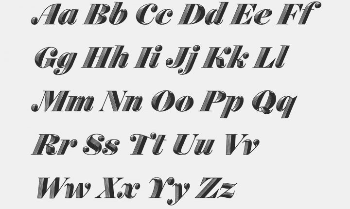
 Obsidian Italic offers a “swashes” feature.Hoefler & Co
That tutorial plays out through a simple sidebar of dropdown menus, toggles, and checkboxes that let users demo fonts in a range of styles with just a few clicks. Take Obsidian, Hoefler’s decorative, 3-D typeface that took one year and a bunch of algorithms to make. Obsidian is programmed to offer swashes—round serifs that resemble the heads of musical notes—on some of its letters. But swashes take up space, so too many in a given word can distort letter spacing. Try.typography knows this. “We’ve built into this typeface a system of logic that says, ‘if this ‘M’ has a swash it would disrupt the rhythm of the word and the way it fits, so don’t use it,’” Hoefler says. “In Adobe you have to go to a menu, within a menu, within a menu, within a menu, to turn this on.”
For designers in certain professions, Try.typography has limits. When asked, a designer and WIRED confidante said the web tool works well for testing web fonts, but makes it tough to see kerning pairs—e.g. TA, TO, LT, and other irregularly spaced letter-pairs—for print. But for students, enthusiasts, and, indeed, working designers, Try.typography offers a neatly parceled, educational way to interface with fonts. And for everyone else, it’s a handy way to try before you buy.
Go Back to Top. Skip To: Start of Article.